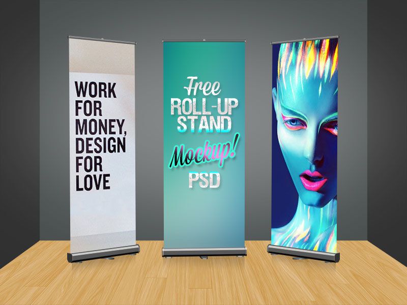
The most important decision when using a banner stand Layout is to choose what message you would like to express to your viewers. Once this main message has been chosen you are able to then branch other ideas from that message and begin to think about the layout of your banner stand graphic. The layout of your display is important so all of your viewers walk away with your main message in mind. A good layout will not only draw people in, but it will also make the presentation something viewers will remember and think about later.

The main idea of your message should be the largest font on the display. It should demand the attention of anyone viewing it. While it is important to make your message clear, it is also detrimental to keep this message as short as possible. The fewer words a person has to remember the better. If this article was being make into a display the largest words on the banner would be Best Banner Stand Layout. These words should act as your title for your banner and should be placed towards the top on the stand. This will allow a viewer to decide if your presentation is going to be interesting to them.
The next aspect you will need to consider is what images you are going to use. The motto of banner stand graphics is less is more. Choose one large striking image instead of many small forgettable ones. One image will allow your viewers to lock in to the main message of the stand and later be able to recall that image and associate it with your presentation. This image should be professional and avoid anything that could be considered offensive. When choosing an image consider the colors that it shows. Images that have fewer colors and colors that are contrasting will stand out more. When selecting an image also consider the color of your logo and try to match them together. This will create a cohesive theme to the banner stand Layout.

When choosing colors for your banner remember to consider how it can be viewed from afar. If your banner has many similar colors everything will begin to blur together and it will not be inviting for the viewers. Choose a background that is the opposite of your font. If your background is dark make your font light and if your background is light make your font dark. Choose a background that is solid. Any patterns or textures in a background will make the text hard to read from far away.
Any information that you want to include should include only a few words. These words can be displayed across your image or underneath for more dramatic impact. These phrases should explain your main topic, much like bullet points. This article could choose the words: main message, 1 striking image, contrasting colors, less is more. These four phrases explain each of the main paragraphs in this text and are easier to remember then a block of information.
Contact information for your company is something that is important for you to provide, however it is not the interesting information people want to read. Place this information at the bottom of your banner to allow the top portion to be the exciting component. If possible add a QR code at the bottom to allow people to access more information on their own time.
The layout of a banner stand graphic is going to be what makes someone stop or pass your presentation by. If your banner has too much information, many images, and colors that fade into each other it is going to be boring. When you are portraying a message for viewers it needs to be exciting and bold.
Visit shop banner stand in california: bannerstandca.com

/image%2F2118508%2F20160808%2Fob_3c6d24_qqqq.jpg)